
Cracks in the Ordinary
Case Study 2025
Preliminary Research & Sketches
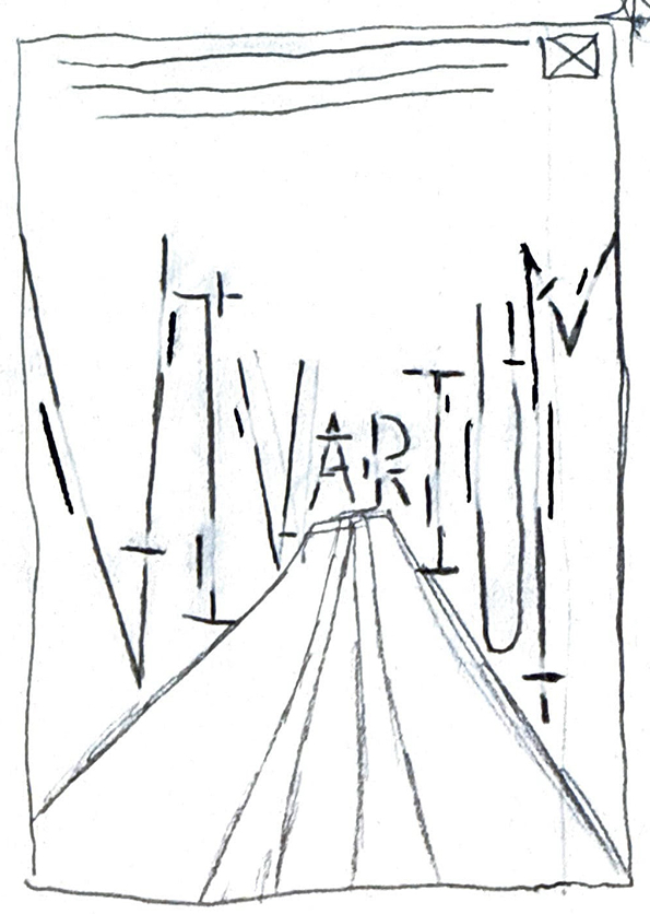
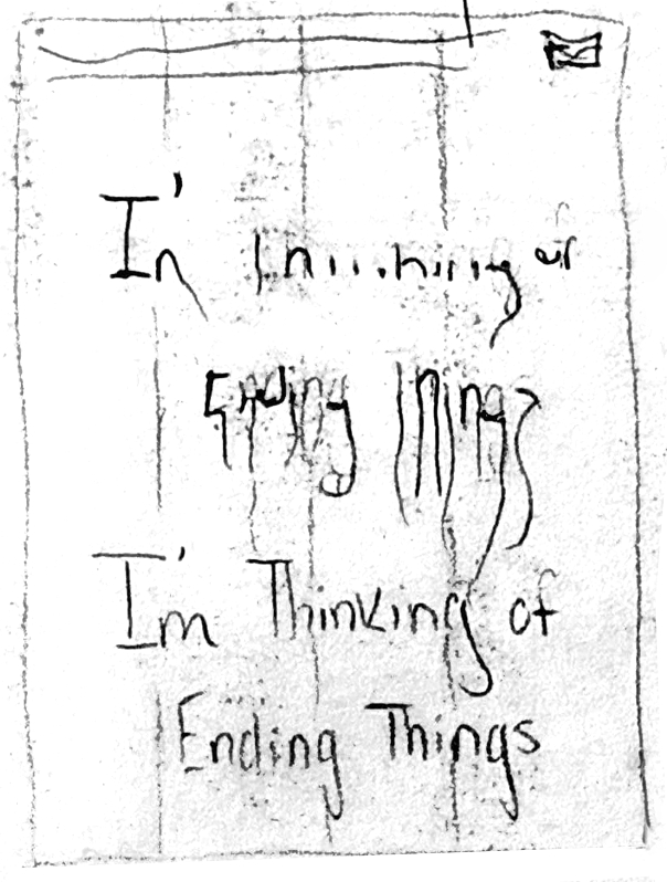
Through this project, a mock film festival with three posters that focus on typography and the way it can transform the page were created. The main goal of this project was to make unique yet cohesive typefaces that follow the themes of the movies they are referencing.
The films chosen are Midsommar, Vivarium, and I'm Thinking of Ending Things. All of these psychological thriller movies make up the Cracks in the Ordinary Film Festival.
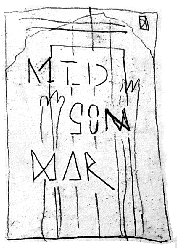
For preliminary sketching, it was important to not include a lot of imagery in them as a challenge to have type be the main focus while still paying homage to iconic scenes from the films selected.
From this, ideas were narrowed down from preliminary sketches into one main final sketch for the final posters (Minor changes were made in the process of making the posters and the custom lettering).
Color Palette, Typography, & Custom Lettering
The next part of the project consisted of picking out typefaces, color palettes, and deciding how to go about doing my hand lettering.
Everything that is illustrated is hand done including the typefaces that make up the film title. All of this was done using Adobe fresco and a strong grid to make sure that all illustrated elements fit in the same area of the final poster page. Once the illustrations were complete they were transferred into Adobe Photoshop and made into tiff images and bitmaps.
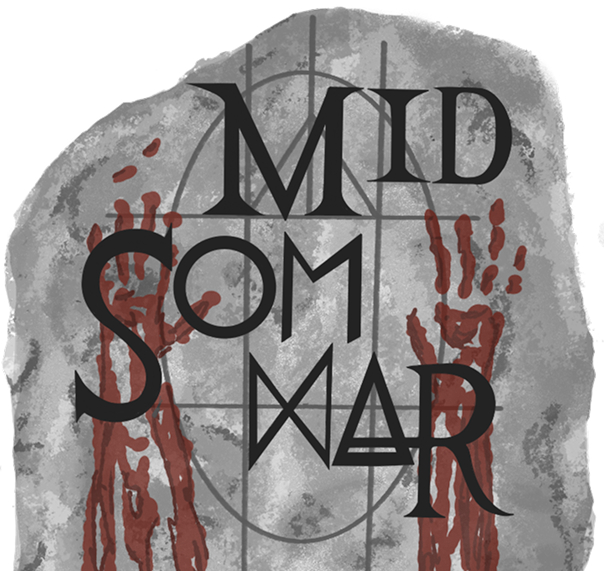
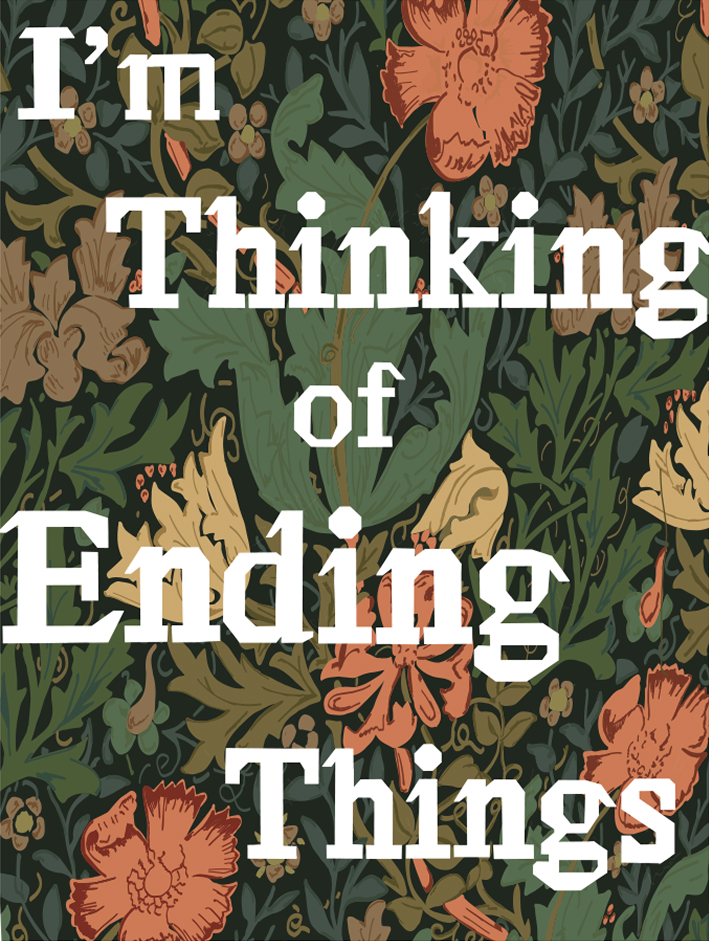
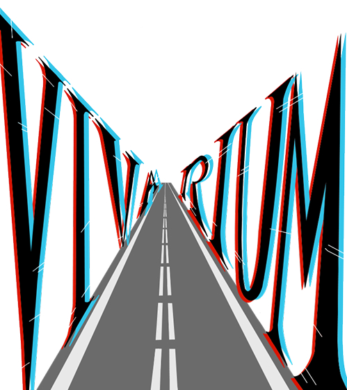
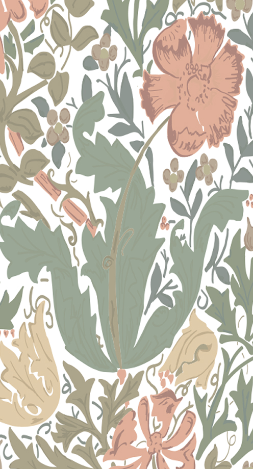
The one recurring element within the illustrations was the blood red type of color. The posters needed to have at least one matching element to help bring them together.
The idea is that if you saw one poster in one area and another poster somewhere else, the viewer would be able to tell that they belonged to the same film festival.
The use of similar typefaces for informational elements like day and time of the festival helped to also bring the posters together.
Final Product
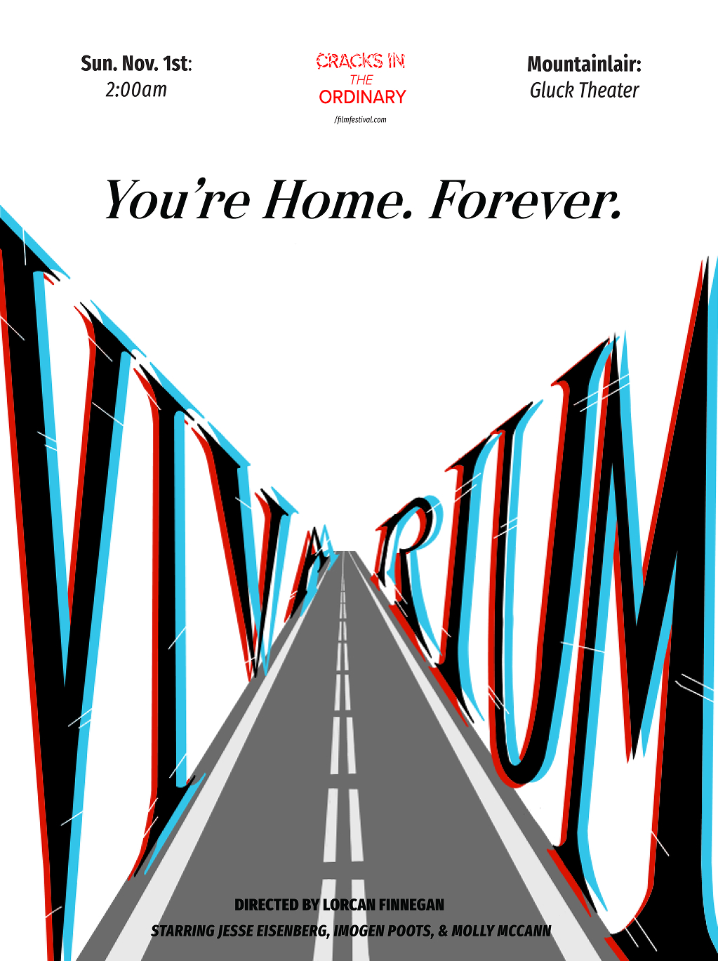
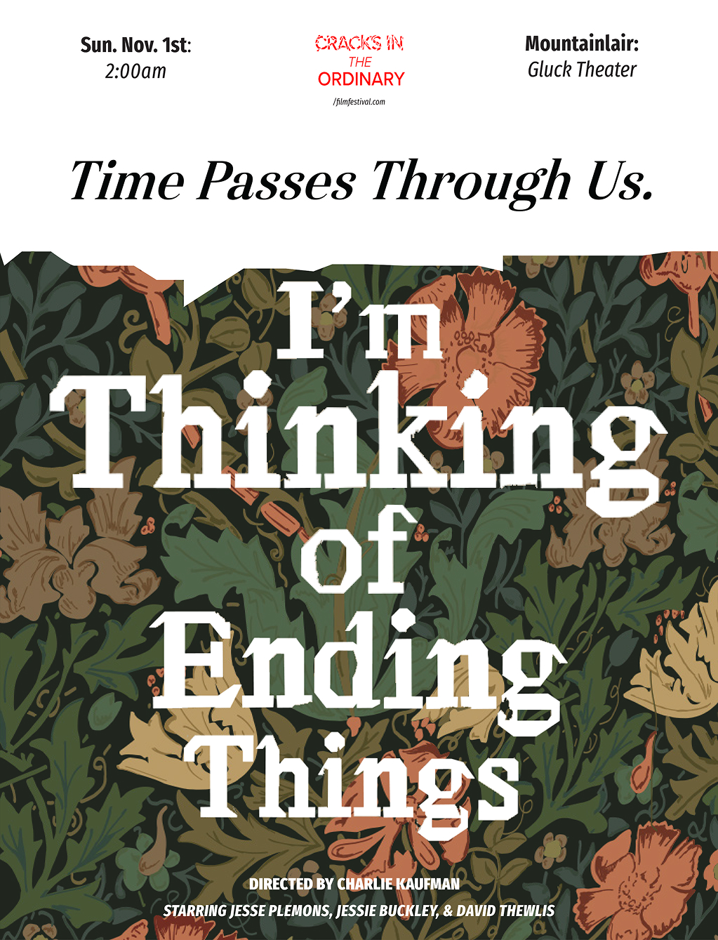
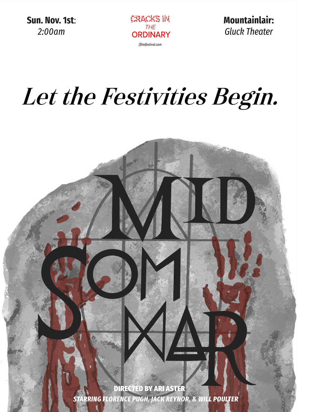
The final three posters are presented below with similar grid layouts and an accompanying film festival title lockup in the top center. The film festival is supposed to take place on daylight savings so when guests enter the festival it will be dark and when they leave it will be bright out.
All three posters have hidden easter eggs in their design that play homage to the original film. In addition to the posters, if guests show up to the film festival they will receive a limited edition sticker pack that matches the theme of the festival and the posters.